General UI Guidance
User Interface Guidance
Detailed guidance for working with specific features in TeamFolio™ will be found in the relevant sections and articles. This section provides some general guidance and tips for working with the more generic user interface components and controls.
Responsive Design
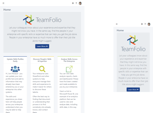
The TeamFolio user interface is built as a web application. It provides some complex functionality but wherever possible, the web user interface follows best practice for making sure the web pages look good and work well on any device you use:


Navigation and Menus
Depending on your permissions, you will be able to use 2 or 3 menus:
- Left navigation menu
- Personal menu
- Administrator menu
Left Navigation Menu
The vertical navigation on the left side of the page is currently only used to access search or to browse profile templates.
You can minimise the left nav to free up screen space for showing more content. This happens automatically if you're using a smaller browser window (e.g. on a phone) but you can also manually hide/show the navigation as follows:


- Click the burger icon (3 lines) to minimise the left navigation;
- Click the burger icon again to show the left navigation;
- If there is room on the screen and you hover over the minimised navigation, it will temporarily reappear.
Personal Navigation Menu
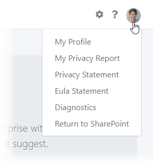
All TeamFolio users can access the personal nav menu by clicking their photo (or placeholder image) in the top right corner of any page:


My Profile
Wherever you are in TeamFolio, you can always get to your own profile fia this menu option.
My Privacy Report
A person's Privacy Report provides a means for viewing and exporting any TeamFolio data stored against your profile. This information includes:
- Data relating to any recommendations received;
- Data relating to any recommendations given to others;
- Any endorsements received or given; what skill they were for, when they were provided and who by or for;
- A list of all biography fields in your profile - skills, experience, qualifications, etc.
Privacy Statement
Some organisations require people to explicitly provide consent to having their details held in TeamFolio, for example in support of GDPR. If this is the case, privacy consent wording can be created by a TeamFolio administrator as a Privacy Statement.
This page shows any active Privacy Statement that you may need to accept before using **TeamFolio.
Eula Statement
This shows the End User Licence Agreement (EULA) for using the TeamFolio software.
Diagnostics
In addition to the log files TeamFolio provides to administrators, a set of basic diagnostic data is available directly to all users via the 'Diagnostics' personal menu item.
This information can be helpful if you need to raise a support issue with TeamFolio support staff in your organisation.
Return to SharePoint
Most deployments of TeamFolio (and all DiscoverMe installations) are deployed as a Microsoft SharePoint add-in. You can switch between SharePoint and TeamFolio without having to log in again. You use this menu option to go to your organisation's SharePoint site that hosts TeamFolio.
Admin Navigation Menu
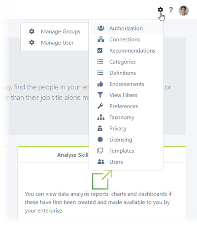
If your user account has been given access to any administrative features, you will see a small cog icon in the top right corner of the web page:


Data grid view
A number of pages in TeamFolio use data grids to display lists of different types of data records. The most commonly used by all users will be for managing skills. If you're an administrator of TeamFolio there will be many more pages that use data grids like the following for managing Definitions:

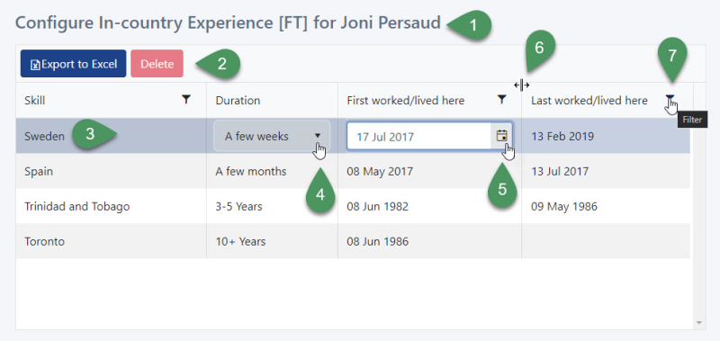
- Generated grid description includes relevant information for the data you're working with;
- Different grids will have different, clickable buttons to execute actions on any selected rows;
- Selected row(s) will be highlighted in a different colour. You can select one or more rows by:
- clicking an individual row;
- left-mouse click-drag across multiple rows;
- Shift+Click a block of rows; or
- CTRL+Click (on Windows) or CMD+Click (on Mac) multiple, individual rows.
- Some cells may allow selection of data from a drop-down list;
- Any cells containing dates will have a familiar calendar date picker. You can still just manually enter type (correctly formatted) dates;
- Column width can be adjusted;
- Control icons may be visible in the column headings. Here we see a clickable filter button that will show additional filter controls for data in that column. :::
Each grid may have different actions available, depending on the type of data being displayed and the permissions the logged in user has.